Remake Upload Notice
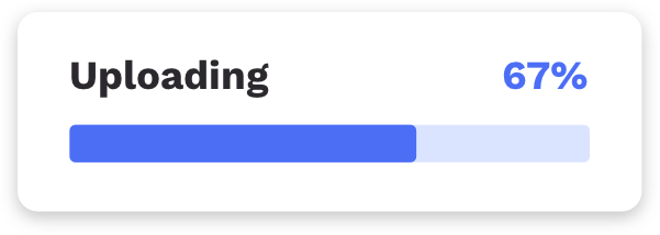
When you upload a file by attaching an update: attribute to a file input element, a progress notice appears in the top right of the page, showing the upload's progress.
You can use the following CSS to customize all of the upload notice's built-in styles.
Changing the styles
Replace any of the following default values to override them. You can also add new styles of your own to completely change how the upload notice looks!
After you customize this code, just load it anywhere in your app.
Note: You'll notice that all the popover selectors are nested under the body selector. This is to give them enough specificity to override the built-in Remake styles.
Default styles:
/* upload notice - displays the progress bar in top right of page when a file is uploading */
body .uploading-notice {
  display: none;
  z-index: 10;
  position: absolute;
  top: 1.5rem;
  right: 1.5rem;
  width: 240px;
  padding: 14px 19px 18px 18px;
  font-weight: bold;
  font-size: 16px;
  color: #2B292D;
  background-color: #fff;
  border-radius: 7px;
  box-shadow: 0px 2px 6px rgba(0,0,0,.24);
}

body .uploading-notice.uploading-notice--visible {
  display: block;
}

/* container for .uploading-notice__status-text and .uploading-notice__status-percentage */
body .uploading-notice__status {
  display: flex;
  margin-bottom: 12px;
}

/* just has the text "Uploading" */
body .uploading-notice__status-text {
}

/* has the upload percentage text, e.g. "77%" */
body .uploading-notice__status-percentage {
  margin-left: auto;
  color: #4C6EF5;
}

/* container for the progress bar */
body .uploading-notice__progress-bar {
  overflow: hidden;
  background-color: #DBE4FF;
  height: 16px;
  border-radius: 3px;
}

/* the progress bar */
body .uploading-notice__progress-bar-complete {
  height: 100%;
  transform-origin: left;
  transform: scaleX(0);
  transition: transform .2s;
  background-color: #4C6EF5;
}
 View on GitHub